Build Behavior Triggers Into Your Imagery and Media For Explosive Conversions
In this article, we want to show you how to slip past your potential customers’ scrutinizing conscious brains and get into their unconscious, emotional thought stream. If you manage this successfully, it will not only mean more sales, more profits, and more fans, but it will also mean a more meaningful presence in your market.
This is how you create a memorable brand.

Get Our Internal Amazon Listing Optimization Operating System HERE 👇
In order to lay this out properly, we first need to explain exactly why images and videos are so important. Yes, Amazon already allocates space for these things in every listing, storefront, and brand page. Yes, they’ve already analyzed billions of customer data points to determine buying habits and themes that will lead to more sales.
However, 99% of sellers on the platform, (i.e. your competitors), are doing the BARE MINIMUM! They simply have imagery or videos displaying their products, with no thought or understanding behind how to optimize them for full message maximization and consumption.
Basically, they don’t know how to create imagery that makes potential buyers buy. But soon, you will.
And it all starts with a primer on how our brains process visual information.
Why Are Images & Video Important On Amazon?

Did you know that your conscious, rational mind processes 40 thousand bits of information per second?
That seems like an incredible amount. Especially if you calculate how much data that is over a whole minute, hour, or day.
However, did you also know that your unconscious/subconscious mind processes 11 million bits of information per second – about 2,650% more! 🤯
Research done by 3M labs concluded that the human brain processes imagery 60,000 times faster than text.
The reason for this staggering statistic lay in why the subconscious processes so much more data than the conscious mind. It’s because the subconscious, essentially, does not have the ability to decode data. It simply makes snap-nano-second judgements about the data it takes in.
Our conscious mind, on the other hand, is primarily for decoding data. Hence why it is so much slower.
Imagery provides a more complete picture of information. That means less decoding is required.
As an added benefit, not only are images and videos better for quickly and easily transferring important information, but they can also elicit emotions.
Many studies on subliminal messaging have proven that imagery shown below the level of conscious awareness still managed to create an obvious emotional response in the brain.
So, to recap, images and videos don’t require as much conscious brain participation because they need less decoding. Being processed primarily by the subconscious mind also puts them directly in touch with the brain’s emotional centers, often eliciting a response.
Please understand, however, that this does not apply to ALL images and videos. Just because an image provides more complete information doesn’t mean someone seeing it will care what that information is.
In the same way, just because a video requires less cognitive effort doesn’t mean it will capture the imagination of the watcher. And all of that doesn’t mean it will make people feel anything.
Media can be bland and boring (there’s a LOT of that on Amazon and other ecommerce platforms). Worse, it can also be overly busy and confusing, requiring mental strain to decipher and understand.
Anything uninteresting, unenticing, or confusing will get the same response: a quick scroll past or an “x” out of the screen altogether.
The key here is that you MUST optimize your media for behavioral triggers if you want to stand out from the crowd. Otherwise, you’ll be another product image floating past the scroll on a browse page.
Behavioral Media Optimization: How To Make Your Images Get Buyers To Act
In order to create imagery that conveys the exact message you want, while also motivating shoppers to take action, you must answer these questions:
Are people seeing important content?
Are people distracted by irrelevant content?
Are people seeing the solution to their problem/desire?
The purpose of asking (and answering) these questions is to determine how much friction exists in your communication.
Friction is the snags, the pulls, the gravity that slows an object down. In this scenario, the object is your prospective customer.

Let’s illustrate this concept with a thought experiment.
Imagine you have a physical storefront, and a giant display window where you show off your most popular wares. Now, imagine the glass on the outside of the window is dirty and smudged. Or, perhaps it has just recently been cleaned and there are streaks.
The smudges and streaks get noticed, and that detracts from the message. All you want people to see is the display, so they can imagine themselves wearing your garments. But instead, they see the window. THAT is friction.
How can you get the answers to these important questions? There are a few methods.
Split Testing
If you’ve spent any amount of time learning marketing, you’ve heard the phrase “Always Be Testing.” That’s because split testing gives invaluable data about which of a given set of options your audience prefers.
This is definitely an important tool in a brand owner’s arsenal, but it shouldn’t be the only one. The reason is because split testing has its limitations. While it gives definitive data on the preferences of an audience, it can only do so in relation to the selections you’ve provided.
Simply put, you can only know which of the two or three images you’ve provided is the best. But you don’t know why, and you don’t know how to improve even on the winning image.
Surveying
Surveying your audience, or a representative audience, is a great way to get people’s opinions of things. The problem is, people most often have no idea why they like something, or how they’d really act in a specific situation.
This makes self-reported survey data very unreliable.
Sure, a crowd of buyers may have said “between these two images, that’s the one that caught my eye.” But that isn’t a guarantee that there isn’t a better, more eye-catching image. Also, that doesn’t mean the interaction would have led to a purchase in the real world.
Heat-Mapping
The most accurate and reliable data is the data that maps behavior based on human, mostly unconscious, action. Data that is derived from what humans do, not what they say.
This is why heat-mapping technology is so valuable to marketing. It shows mouse hovers, clicks, scrolls, and time spent on web pages. That data tells volumes about what people are focusing on on the page.
You’re probably thinking, “Wow, that sounds great. I can implement that on my website, but what good does that do for my Amazon store?”
That would be an understandable question too, considering that you cannot install heat mapping software onto your Amazon listings.
HOWEVER, you can train an A.I. with real human heat map data so that it replicates human behavior (with 94% accuracy).
Technology has come a long way. Let’s get into the insights this amazing artificial intelligence can offer.
Example Heat Map Data

Above we have a client who had a very specific goal, to make the price stand out. In this particular market and season, the price was the competitive advantage and so it was key that this be the content that was absorbed by browsing shoppers.
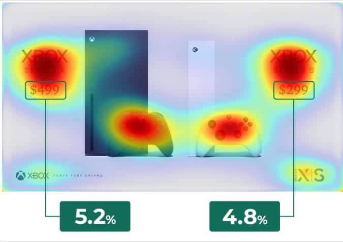
Our initial heatmap analysis revealed that the price, while a focal point, was only getting around 5% of total attention.
After studying the data, we made some modifications to improve this ratio.
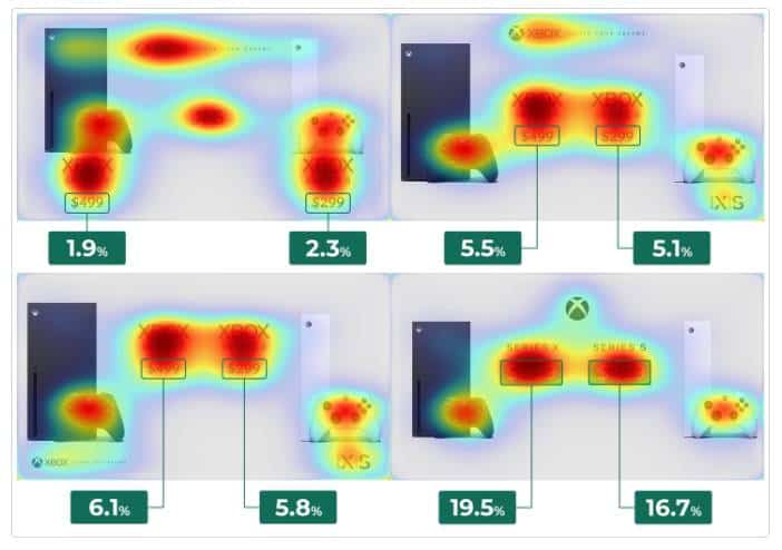
You can see here that after testing multiple layouts, we found one that increased focus on the price to almost 20%. As a result, this image optimization led to vastly increased conversions.
Overall Observations From Heat-Map Data
After observing countless heat maps, we’ve seen a trend in the behavior with regard to Amazon listings. Here are some of our findings (these will be helpful for media optimization):
The Vision Arch
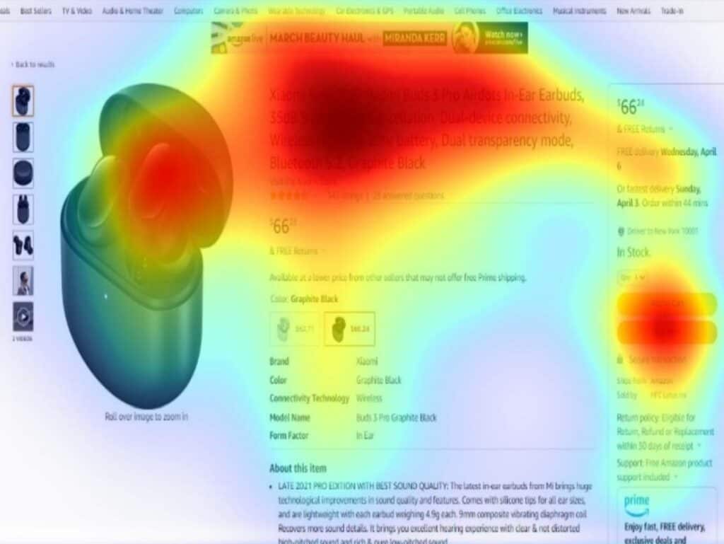
People generally tend to view Amazon listings in the same pattern. It shapes an arch and covers the main image, the title, and the right side bar down to the “buy now” button.
This further emphasizes the importance of the main image. It also illustrates the importance of the title and being in stock (as they are checking to make sure the buy now button is available).
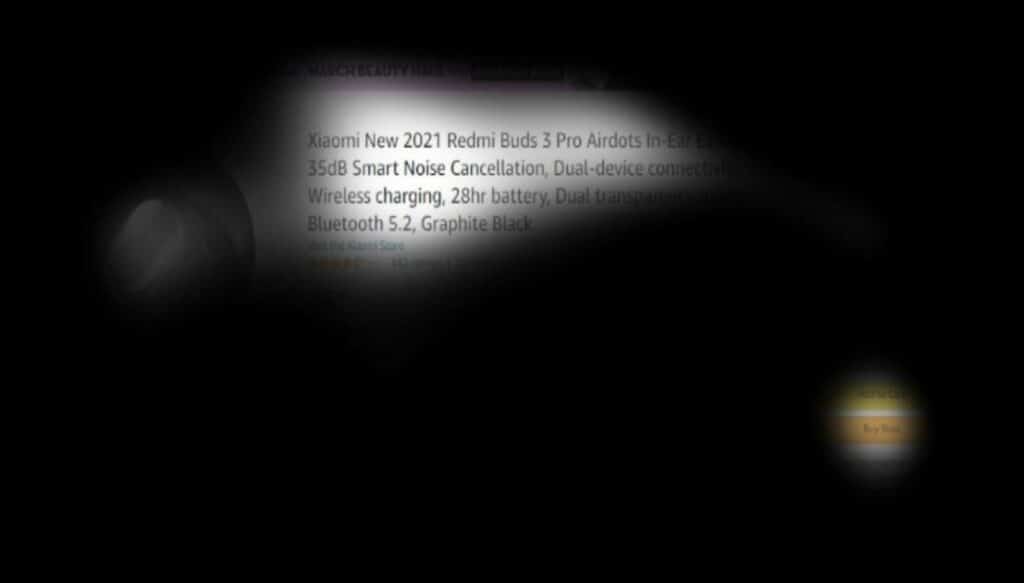
Above is a “blackout vision” of the same image to illustrate just how much focus is put on certain listing elements, and how much other areas are ignored.
The Power of Faces
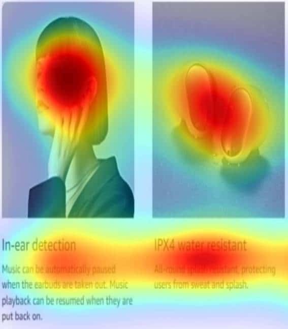
If there is a face in the image, it gets the majority of the attention. Faces are a critical component for effective marketing for a couple of reasons. We humans are more trusting toward other humans, as opposed to faceless brands. Also, when our demographic is pictured, it makes it easier for us to imagine being in the pictured situation.
Remember, reducing cognitive effort leads to easier purchasing.
You still want to use faces strategically, however. Since they draw most of the attention, you want them to emphasize important content, not take away from it. Using a pretty face, for the sake of using one, that doesn’t represent your target audience, and isn’t using the product or otherwise in a setting that makes it apparent what you are promoting, can be more of a distraction than a help.
Image Text
Including text in an image is a great way to get important stats and data to your would-be customers. Imagery even helps our brains decode text, so it’s an effective way to reduce cognitive load.
However, too much text, or text that is just a bit too small, will be completely ignored. When key points are outlined in bold, large font, strategically placed near other objects that draw the eye, they get absorbed.
Sizing
The size of images, and objects within them, are also important. Over-stuffed images, with too many small windows of objects or faces, reduced attention greatly. Images with lots of repetition (same object or text repeatedly) had the same effect.
Images that were clear, large, and focused on only a few elements tended to get the most attention in the most critical places.
A Quick Note On Other Benefits To Media Optimization
There are ancillary benefits to strategically optimizing your imagery as well.
Imagery that is perceived by the unconscious and slips past the guard of the consciousness will make the content seem more trustworthy. Trustworthy content often transfers that trust to the creator of the content. And, as we all know, people buy from those they know, like, and trust.
Repetitive cues in imagery can also improve conversions. When we humans are introduced to an idea or concept multiple times, our brains conflate that repetition with fondness. Meaning, if we see a brand over and over again, we start to believe we like that brand. That’s why logo placement and theme colors/objects are so important.
The Amazon marketplace, specifically, also offers unintended benefits from this process. Imagery that manages to evoke emotion will likely be lingered over. Lingering on an Amazon listing before diving deeper into the content and then the product being added to a cart are all relevance signals that should yield higher keyword rank.
How To Remove Friction From Your Media
We’ve gone over why imagery is important. We’ve gone over how to gather data to see what your audience is focusing on. We’ve gone over the benefits (from a psychological viewpoint) of optimizing your media.
Now the million dollar question is: how do I implement this?
Here are the best practices for images:
Depict Your Audience
Using human faces in marketing materials almost always increases conversion rates. Reports from across the marketing and advertising industries vary in how much; some reporting modest gains of 4% while others seeing upwards of 50 to 100% increases.
One thing remains the same, however, and that is that the direction of conversions, and therefore sales, seems to always be up.
This is likely due to a number of factors:
- Having a sense of knowing who is behind a product or service helps us trust them more. It gives us a sense that we can hold someone accountable in the event something goes wrong.
- Seeing other people taking an action (such as using a product) helps us to imagine ourselves doing the same thing.
- Seeing other people using a product illustrates to us that other people are also interested in this product (even if consciously we know they were just paid to pose for the picture).
All of these are powerful triggers, but they are made all the more powerful by ensuring that the person you are depicting represents your target audience. When your audience can see themselves in your imagery, it requires less imagination, and therefore less cognitive power.
Use Action
This was alluded to in the previous section, but just showing a person’s face isn’t as effective as showing that person using your product. The action helps with the prospective buyer picturing themselves using it. It also helps to demonstrate its use (this is important).
Focusing on action is also a much more effective way of getting people to act. Because of mirror neurons, our brains are wired to mimic activities we see. While our brains are unconsciously mimicking the act of using a product, this will obviously make the idea of actually using that product a more attractive option.
Use Text Sparingly
It’s understandable that you want to ensure your customers have all the relevant information about your product, but using too much text in images does not have a positive effect. It will largely be ignored and takes up valuable space.

Above is another blackout image. There is a paragraph of text in this image, yet the headline in the largest font is all that is really focused on.
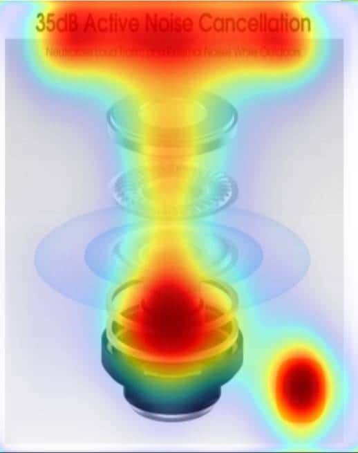
Contrast that with THIS image (above), where you can see the very sparse text is a major focus. This image shows that people will focus on exactly the important content.
Keep the Image Uncluttered
Don’t give people too many things to focus on at once. It gets confusing, and a confused mind shuts down. Furthermore, it can dilute the message. If you have an important piece of information to share, than anything not relevant to that information is noise. And noise is distracting.
Create Associations
This is where we really leverage knowledge of how the brain works. Associations are basically the memories or concepts that come to mind when we think of something else. In the context of brands, we’ll give you a few common examples:
- When you think of Nike, you think of athletes or athletic activities
- When you think of Apple, you think of sleek but expensive tech
- When you think of Amazon, you think of fast shipping and secure ordering of products
Obviously everyone’s associations are different and unique to them. But this is an example of the common associations with major brands. And these associations didn’t happen by accident; they were engineered.
You too can (and should) begin to engineer associations with your brand. You do this by being strategic with the items, images, concepts, and sounds that are in your media.
Want to be associated with environmentalism? Make sure there are plenty of plants in all of your images and video. Want to be associated with the outdoors? Show mountains and rugged terrain.
It doesn’t have to be complicated. Just purposeful. So make sure you strategize the things that go into your media to ensure you are creating associations that will serve your brand.
Create Familiarity
Similar to creating associations, you want to include consistent themes to also help create familiarity. Our human brains are somewhat flawed in the way they interpret familiarity, as we usually conflate it with fondness. That means that as something becomes more familiar and recognizable, the more we favor it, even if we have no good reason to.
If you want your brand to become familiar and recognizable, using consistent themes is a great place to start. This means using a branded color-scheme in EVERY piece of media. Using your logo in most images and always featuring it in the same place. Making the logo something recognizable and easy to interpret.
This is the reason why commercials use jingles. Catchy tunes get stuck in your head, and that breeds familiarity for the brands that feature them. You may even consider a jingle yourself for your video content.
Here are the best practices for videos:
Make It Personal
We humans simply respond better to personal communication. It’s one of the reasons why we love to hear our own names. It means the attention is on US. So how do you make your videos personal for the masses of strangers? Here are a few tips:
Be specific. Show in full detail what problems your product solves, or what desires it fulfills. The more specific you are here the more the people who share those problems or desires will feel like you’ve catered your solution for them.
Depict your target audience. We’ve already gone over this, but here it is again. It’s that important. Have your target audience represented in your videos and your prospective customers will feel more like you are speaking to them.
Call out your target audience. Similar to the first suggestion, to be specific, you also what to specifically call out who your product is for. Be very clear who could benefit from your product so there is no ambiguity about who should be paying attention to your message.
Make It Tangible
Remember when we talked about having “action” in your photos? Well, the same applies in video, but with an additional caveat. The best way to make your products tangible to your would-be buyers is to demonstrate its use in comparison with a competing product.
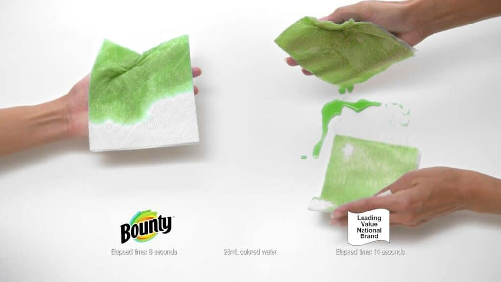
Paper towel brand Bounty has been running commercials that depict their product’s superiority over competitors for years. This is because it is very effective.
Seeing something in action is useful to our brains, but we still need a reference for comparison. That’s just how we humans work, we reference and compare everything. Showing your product in use, and showing off how it is superior to a competing product, is some of the most impactful visual content you could create.
Trigger Emotion
This is definitely easier said than done, but if you nail this, you seal the deal (i.e. make the sale). Here are a few ways you can trigger emotion:
- Be authentic. People will relate to an authentic story, which is likely to make them feel something.
- Tell a story. Happy or sad, a story always captures the imagination.
- Have a common enemy. Anger is an emotion too, and if you can rally your audience to your side in a battle, you can stir it up a little.
- Tell a joke. If you make people laugh, they will remember you with fondness.
There are many other ways to achieve evoking emotions, but these are just a few ways you can get started.
Here are the best practices for general media symbolism:
Avoid Closing Effects
Don’t shut doors, tops, cabinets, car doors…anything. This triggers a closing, or ending of something and you don’t want that. You want to do the opposite, which is to open doors of opportunity to your product.
Avoid Transactional Symbolism
Don’t use currency symbols or depict money at all. The reason is because humans separate transactional encounters in their head, and reserve those for more scrutiny and less emotion. Just like when a friend asks for money in exchange for what you thought would be a favor, reminding people of the transactional nature of your relationship could sour the experience.
Avoid References To Lists Of Information
Most people do not enjoy non-leisure reading. It represents cognitive effort and the opposite of anything relaxed. As such, you shouldn’t show or reference lists of information. That means avoid depicting ingredient lists, or supplement fact labels. Instead, just list the important ingredients one by one.
If you are referencing a publication, avoid showing the body text, but instead just show the headline. These are just examples and your product may not require reference to any lists at all. Just be conscious of this when making video, or any media, content.
Avoid Confusing Or Contradictory Concepts
Our brains hate contradictions. It’s true. When we catch one, we immediately feel uncomfortable and confused. Anything that stirs discomfort or confusion will be rejected, immediately.
So, don’t confuse your audience or contradict yourself. Be as clear as possible about your message and what you are trying to convey. Be up front and honest about expectations, and you’ll avoid this disastrous pitfall.
What You Can Do To Level Up Your E-Commerce Media
Ok, we covered quite a bit there. We went over why media content (images and videos) are important, how our brains work, how to optimize media for the human mind, and how to create the best content possible.
To put it all together, here’s what a checklist for optimizing and creating great imagery and videos looks like:
- Heatmap customer behavior tracking
- Optimize existing imagery based on data
- Implement comparison imagery (if it doesn’t already exist)
- Implement infographics (if they don’t already exist)
- Create more engaging video content
- Focus on psychological triggers in themes and associations
Ultimately, it all boils down to making it as easy as possible for people to discover that your brand and products are the solution they’ve been looking for.
And of course, if you need help with images, video, optimization, and heat mapping, Signalyltics has you covered.

